Manually exporting, filtering, and emailing PDF reports from Power BI is slow, frustrating, and expensive. BI Helper automates the entire process, so that you can:
Why spend time on tedious reporting tasks when automation can do the work for you? Switch to BI Helper and focus on making data-driven decisions, not managing reports.
Every business relies on data, but raw numbers mean nothing without effective reporting. That’s where Power BI comes in and transforms complex datasets into interactive, easy-to-understand reports that drive business decisions.
From tracking financial performance to monitoring sales trends, Power BI enables you to turn data into insights, but only if reports are structured correctly. A well-designed report ensures that the right people see the right data at the right time.
Yet, for many users, creating and sharing reports feels like a chore. Manually filtering, exporting, and emailing reports every week? That’s not efficient. This article provides an overview of Power BI reporting, covering the key components, best practices, and why BI Helper is the smart way to automate your reporting.
New Power BI users often confuse reports and dashboards, but these serve very different purposes. Choosing the right tool for the job makes reporting more effective.
Many businesses use both, but for teams managing complex data reporting, dashboards alone aren’t enough. Power BI reports provide deeper insights, especially when automated with BI Helper to streamline delivery.
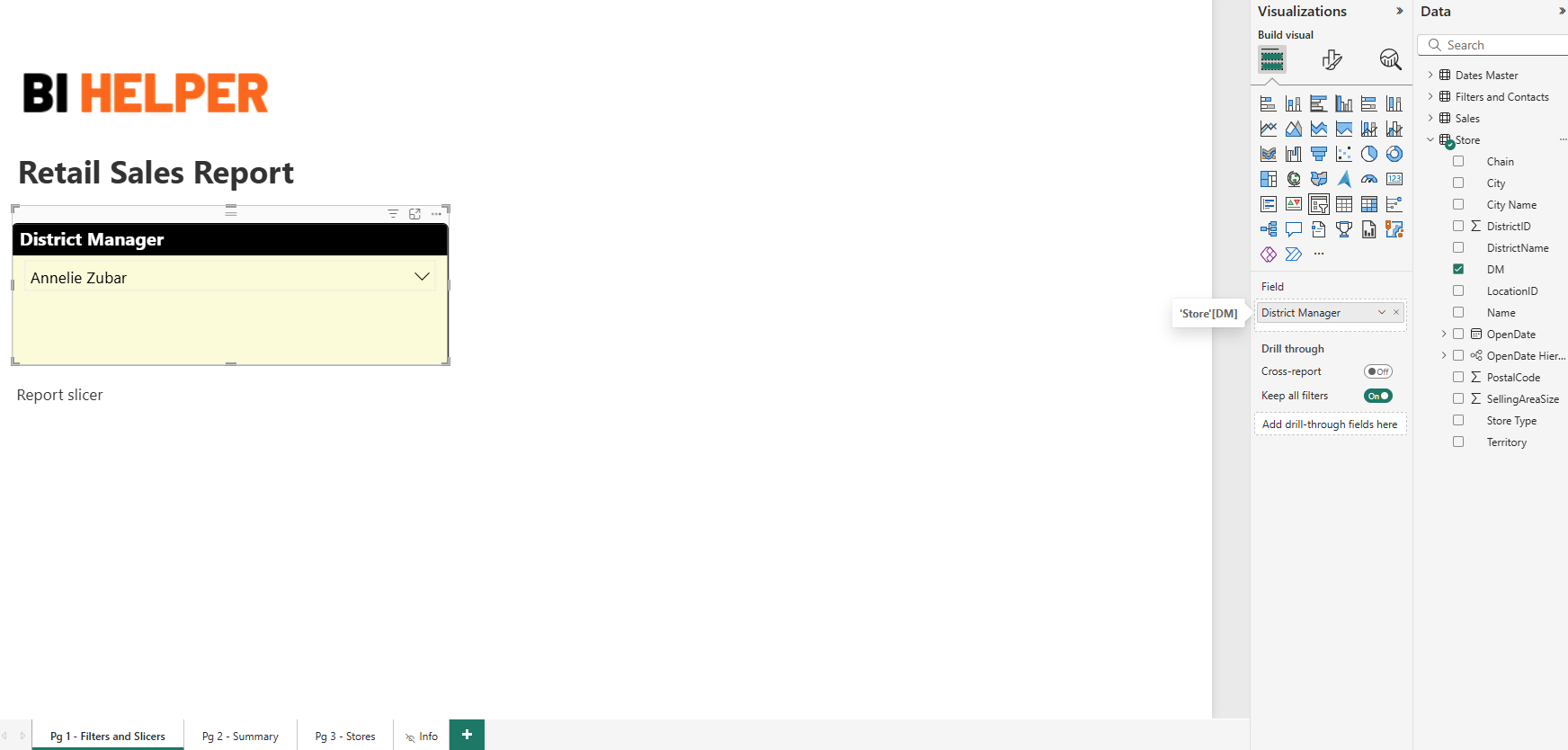
A well-structured Power BI report is built on three core elements: data sources, data modeling, and visualizations.
Data Sources and Connectivity: Power BI connects to a wide range of data sources, including:
The key to effective reporting is ensuring data integrity - inaccurate or outdated data leads to misleading insights, which will negatively impact decision-making.
Data Modeling: The Foundation of a Good Report: Building a strong data model is crucial for creating good reports. This involves:
A well-structured Power BI data model prevents errors, improves report speed, and ensures that users can easily extract the right insights.
Visualizations: Bringing Data to Life: Choosing the right visuals is essential to making reports clear and impactful.
A poorly designed report can confuse users rather than inform them. Clean layouts, logical data flow, and minimal clutter make reports easy to understand and deliver the best value from Power BI
.
Design with the End-User in Mind: A Power BI report is only useful if it’s easy to interpret. Always structure reports based on the user’s needs:
Keep Reports Clean and Organized: Ensure that your reports:
Optimize Report Performance: Reports with slow load times frustrate users and delay decision-making. To improve performance:
An optimized report is not just faster and easier to maintain - it’s way more effective at delivering insights.
Challenges of Manual Report Distribution: Manually exporting and sending Power BI reports as PDFs is time-consuming, error-prone, and inefficient. Common problems include:
How BI Helper Solves These Challenges: BI Helper automates Power BI report generation and delivery, eliminating manual effort while reducing licensing costs. With BI Helper, businesses can:
For teams managing high-volume reporting, BI Helper ensures timely, accurate, and cost-effective report distribution.
A mid-sized financial firm was spending over $6,000 annually on Power BI Pro licenses for 50 employees. With BI Helper, they are able to:
A supply chain company needed to distribute daily inventory reports to regional managers. With BI Helper, they:
Stop wasting time on manual report creation and distribution from Power BI - automate with BI Helper today!